 Prev
Next
 Site Map
 Home
Home
| . | . | . | . | David McCracken |
Documentation Examplesupdated:2018.09.07 |
One of my guiding principles is that documentation is an integral part of the design process and not an afterthought done to satisfy some formal requirement. To be effective, design documentation should match real design process, i.e. “form follows function”. The only form that does this is a marginally constrained web. The project web is too complicated to be published as a single document but it serves as the primary source for all other (secondary) documentation, whose forms can be highly constrained. CDX System and Hardware Design is a small piece of a complex project web.
I have found certain secondary documentation forms to be especially effective for the kinds of information that I want to convey. Most of my documentation is for colleagues and customers who are using something that I have given them. For this limited domain-cognizant audience, the most effective vehicle is a hyperlinked document comprising mostly text. I can compose this quickly, often simply copying pieces of the project web into a document shell. Charts and graphs also can be composed quickly but are useful only for homogeneous data sets.
Diagrams and videos require considerable time and effort and I produce them only when it is clear that they are needed and will help my audience to understand the information. I have not found any formal diagramming method to be of general value. I produce flow charts for patents because that is the standard process diagram method. To communicate generally, I mix metaphors in whatever way seems to best convey what I want my audience to understand.
One of the most difficult forms of documentation is an article written for general publication. These are constrained by the rules and purpose of the publication; they require effective diagrams; text must be pared down to the minimum without losing continuity or creating ambiguity; and they have to say something that people want to hear. When all of these criteria are met and I coincidentally have some free time, I have written published articles.
I have written the descriptions for my patents. This is easy. I have also participated in writing claims, which is unlike any other form of documentation. Most of the rules are inverted. Anything that would make other documents good will usually make claims bad and vice versa. I would not trust my own judgement in writing original claims but I understand the model well enough to offer appropriate technical advice and corrections within the claims framework.
I extensively hyperlink nearly all of my documents. Over years of use, I have developed and refined a method of linking that is applicable to all document types, regardless of their purpose. My documents have external and internal links. External links are to other local documents, often to a specific bookmark (a.k.a. partial URL), to local directories and programs (invoking the program by link), and to Internet sites. Internal links are to locations in the same document. There are two independent internal link systems. One is based on the document's organizing principle, i.e. major key. It comprises a table of contents and forward and backward chains for stepping through major topics. This form has no relationship to external links. The other form links specific issues into threads that weave freely throughout the document. These threads also contain any external links.
Most of these examples are MsWord documents exported as HTML for web presentation. I have repaired serious damage but I haven't done anything to improve the layout, which is not as good as the originals or as web pages that I create from scratch. All of the internal hyperlinks function as in the originals but the external links are broken.
The major organizing key for my design history documents is time, usually derived from regularly scheduled meetings or from an email or online discussion thread. Meeting minutes are always distributed to participants for review and correction at the next meeting. The original minutes are not changed and are copied verbatim into the history document, where two types of additions are allowed, non-obliterating line-through and links (source and destination).
CDX System and Hardware Design is a time-ordered design history document. The major organizing key is a regular meeting and most major topics are simply copies of the meeting minutes. However, a few topics directly related to individual meetings but not by time are also included.
My technical description documents are ordered by topic. I intend them to read like a book. They usually retain some design history to help explain the rationale for what might otherwise appear to be arbitrary decisions but this is condensed to avoid disrupting the discussion flow. More detailed design history is provided by links to design history documents, much like footnotes.
Stepper Motor Controller is a technical description document describing the final design of one complex system. This includes architecture, hardware, firmware, and software. Most design history is provided by external links to local design history documents. This particular document coincidentally illustrates some of my more recent linking artifacts, notably the “Next Topic”, “Main Topics”, and “Top of Topic” links in every major topic. These facilitate navigating the major key chain. Clicking “Next Topic” not only goes to the next major topic (whatever it is) but also places the cursor on that topic's “Next”, enabling rapid stepping through the topics. The regular layout of links and bookmarks enables the “Next Topic” links to function without knowing what that topic is. Consequently, topics can be rearranged without breaking the chain.
My user reference documents are similar to technical description documents but more constrained and limited. I usually do not mix domains, for example hardware and software, even if they are intertwined in the topic but instead create separate documents with mutual links. In my reference documents I normally begin with an overview to provide context (with links to contextually related documents) followed by categorical descriptions, which explain some general issues. These are relatively brief. The bulk of the document comprises details, which would not normally be read like a book but used like a dictionary as needed.
Script Language Reference is the main reference document for laboratory instrument developers to write programs in the instrument development script language that I designed. The language changes dynamically in response to changes in the instrument configuration definition, which is written in my configuration language, which is quite different from the script language. Other reference documents describe that language and specialized topics. The script language reference exemplifies my usual approach, where I describe many items using a repeating pattern, in this case syntax, description, examples, errors.
Release notes are the only documents in which I don't normally include hyperlinks. The form is purposefully terse and organized as a list (literally or figuratively) and the reader is not expected to drill down into any particular topic. Additionally, these documents may be read in a variety of venues, making external links inconsistent.
WinCE Touchscreen Software Release exemplifies my release note style. I begin with a synopsis, followed by content list, installation instructions, new features and corrections and differences from the previous release, and detailed explanations of specific new features. The current release section is followed by the full text of each of the preceding releases in reverse time order.
I produce technical videos when they convey information that cannot be effectively presented by documentation forms that require less time and effort. Technical videos are subject to many of the same criteria that determine the quality of one for a general audience. In particular, the audio and video must be coordinated to deliver the information. This is much deeper than superficial synchronization.
Just as in a popular movie (or opera, musical, dance, etc.) a technical video contains a number of important points that must be connected by less important interludes to avoid the distraction of discontinuities. Typically, the high points occupy a small time slice in the video but the majority of what must be said. A good screenplay uses the interlude time before and after a local climax to prepare the audience and then explain what has happened at the critical point. This makes the interludes, which comprise boring but necessary visual information, more interesting while relieving the pressure to cram all of the important dialog into the small time frames of the climaxes. For example, my random sample handler video was originally 20 minutes long (even after cutting the raw footage), excruciatingly boring, and did not contain as much technical information as my 90-second final version made from the same raw footage but with a more carefully crafted screenplay.
I include screen shots in most user documentation for anything with a computer display. If the file is a Word or Libre/OpenOffice type, the viewing program will automatically properly display an embedded screen image. Web browsers will not. Non-browser viewers can export a native file to html, converting embedded images to jpeg but they will define the img tag with fixed height and width, causing a screen shot to render particularly poorly. Many web builder tools also do this. Whether coding by hand or using a tool, I always have unsized img tags and design my page layout accordingly.
User documentation often requires a series of successive screen shots. Sometimes the transition from one to the next is ambiguous, possibly involving multiple subordinate transitions. However, if too many minor screen changes are embedded, the document becomes tedious. In these situations, I use a screencast, which, like individual shots, renders without distortion and consumes relatively little bandwidth but shows continuous sequences more like a video. The screencast of my FCS (Flow Cytometry Standard) big data analytics program is an example.
Diagrams are rarely a useful analytical tool but they can be valuable to convey the results of analysis, in effect paraphrasing the result. To be effective in this way, the diagram must be one picture. Hierarchical diagrams are too confusing. They impose an abstract non-visual relationship on a presentation whose purpose is to represent something visually. A diagram should provide an overall sense of structure rather than attempt to answer specific questions.
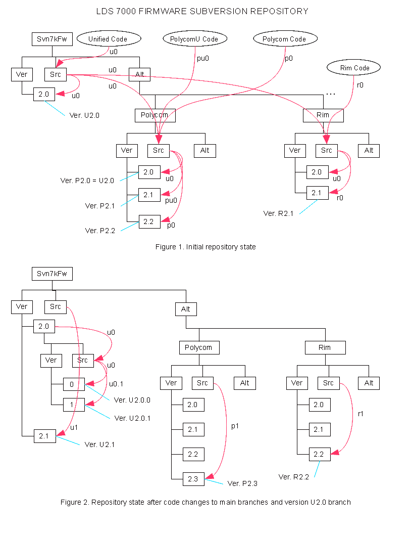
I created this diagram for a software workgroup. The group was composed of sub-groups, each working on a unique branch of what was once a single program. These divergent branches were not controlled or connected in any way and some had already gone into OEM products. I planned to merge all of the branches into one trunk but I didn't want to discard branches that had already been published. I interviewed all of the programmers to determine what code bases they thought they were working on. I examined all of their processes to find things that they were inadvertently using. I reduced the number of code bases by merging duplicates and deleting ones that were not used or distributed. This still left several branches and no obvious trunk. To merge these into a unified repository, I chose one, based on programmers' preferences, to be the trunk. The others would all be branches, which I would merge “back” into the trunk and seal to prevent further changes.
I built and tested a scripted transition mechanism in a sandbox so that the live transition to the new version control system would occur in seconds. Nevertheless, the programmers would still have to learn new habits. Memorized file locations and procedures that they had been doing automatically would no longer work. As is typical in most organizations, they were working under deadlines and were given no credit or leeway for the disruption that I was about to impose on them. Asking them to read my analysis would just be seen as another uncredited burden.
I created this diagram for the programmers to see at a glance how the various branches, including their own, were merged into the new unified repository. The contribution of a branch can be traced like the flow of a tributary into a stream and the stream into a river. They don't have to ask, “where did my program go?” or “why am I now working on someone else's program?” This diagram can't answer detailed questions like how or why I changed specific functions to merge the variations but it does explain the overall framework motivating and guiding these changes. This prepares the programmers to understand that the changes are not simply an arbitrary imposition.
One of the problems with formal diagramming methods is their domain restriction. While it might seem intuitive that a single diagram couldn't logically combine, for example, physical, electrical, software, and time elements, this sort of mixing is often precisely where a diagram could help to clarify an otherwise confusing situation.
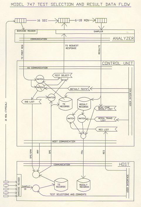
I created this diagram to paraphrase a complex mixed domain workflow common in medical sample processing laboratories (“reference labs”). Individual sample (mostly blood) tubes arrive at an input facility outside of the actual lab, although usually in the same building. Their barcodes are scanned at that point and accompanying information entered into a management computer (Laboratory Information System). At this point, an individual sample is no longer an atomic entity but more of a quantum entanglement between its physical part and its information. The information comprises not only relatively timeless things like where to send the results but also the tests to be performed, which must be conveyed to the testing instrument no later than when the physical sample arrives.
The abstract information and the physical sample, following completely different paths, must coincidentally arrive at a specific point in space-time. My diagram includes enough detail of the complex information path to inform and guide programmers of the three computational entities (host/LIS, control/data, and instrument computers) so that they understand how what they do fits into the overall flow. This requires the diagram to include completely abstract program entities, semi-abstract communication links, physical representation of individual tubes and tubes collected into groups (“racks”) in a common timing framework.
Many people told me that they could not comprehend the overall system until they saw this diagram.
My documentation tends to be more text than pictorial. The main motivation is that it takes me much less time to convey a certain amount of information by writing than by drawing. The text is also much easier to modify and to cut-and-paste to create related documents. However, I do add simple drawings to my documents when the effort seems worthwhile. I have used MsWord's line drawing capability but it is not ideal. When I have a choice I use LibreOffice Draw and include these drawings by reference (whether the file is doc or html).
